Hallway Decor: 15 Photo Display Ideas to Greet Your Guests
Walk through your hallway tomorrow morning and count the steps. Six? Eight? Twelve? Most of us cross the same stretch of wall dozens of times a day without ever really seeing it. It is the part of the home we live in the most and look at the least.
Which is a shame, because the hallway is also the first thing every guest sees. The handoff between the outside world and your home. The mood-setter. Done thoughtfully, a photo display in this space pulls double duty: it welcomes people in and gives you something to smile at on the way to refill your coffee cup.
This is not a piece about throwing a few frames on a wall and hoping for the best. It is 15 specific photo display ideas that actually work in American homes — short foyers, long corridors, narrow squeezes, awkward stair landings — with the practical numbers you need to make them look right. Some are quick weekend projects. Some are bigger commitments. All of them have been tested in real homes.
First, a few things that turn any wall from messy to magazine-ready
Before the ideas, four numbers worth committing to memory. These are not opinions; they are the difference between a display that looks intentional and one that looks like an afternoon went sideways.
Hang at eye level. The center of your arrangement should land roughly 57 to 60 inches off the floor. Most people hang things too high. If your photos feel like they are at attic-level, they probably are.
Keep spacing consistent. Two to three inches between every frame. Pick a number and use it everywhere on the wall. Inconsistent gaps are the single fastest way to make a gallery look amateur.
Match width to furniture. If your display hangs above a console table, bench, or radiator cover, aim for the whole arrangement to span about two-thirds the width of the piece below. A 48-inch console wants roughly 32 inches of art above it.
Leave room to breathe. Aim to fill 60 to 70 percent of the available wall, not all of it. Empty space around the prints is what makes the display feel curated instead of crammed.
Tape paper cutouts of every print on the wall first. Look at it from the door. Look at it from the stairs. Move things around. Drilling is the last step, not the first.

15 photo display ideas for your hallway or entryway
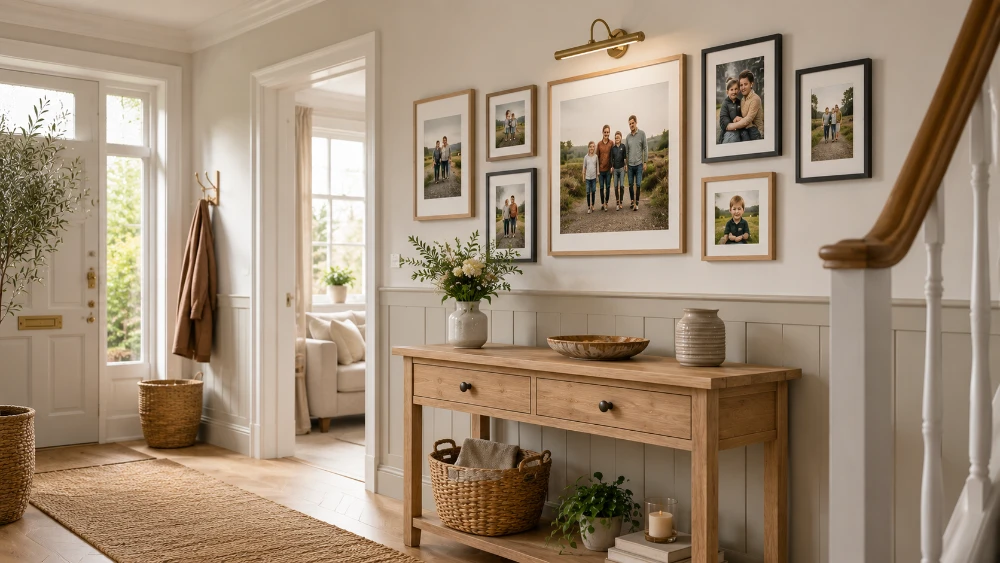
1. The clean grid above the console
Six or nine identical frames in a perfect rectangle, hung directly above a slim console table. This is the workhorse of entryway galleries — it suits almost any style, photographs well for social media, and looks correct in homes ranging from suburban new builds to Brooklyn brownstones.
The whole effect rests on uniformity. Same frame color, same mat color, same orientation, same spacing. If your photos are a mix of color and black-and-white, convert everything to black-and-white before printing — the grid is meant to read as one object, not as nine competing snapshots.
This is one of the few cases where matched framed photo prints beat every other format. The wide pure-white mat creates breathing room around each photo, and the clean black or warm-wood frame gives the wall a gallery feel without trying too hard.
2. The salon cluster
The opposite philosophy: a deliberate mix of sizes, shapes, and frame styles arranged in a loose cluster, with one larger anchor piece sitting slightly off-center and smaller pieces filling in around it. Salon style feels collected. Like the wall grew over years.
Start with the biggest print. Place it a little above the visual center of your wall plan. Work outward, keeping the same spacing between every print as you go. Mix orientations on purpose: tall, wide, square. Mix photo subjects too — family, landscape, a piece of artwork, a vintage map.
The one rule that holds a salon cluster together is frame discipline. All black, all white, all warm wood, or a deliberate two-color mix. Random frame colors look like clearance shelf finds, not a designed wall.
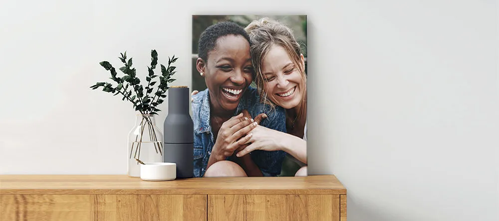
3. The single oversized statement
Sometimes one big print does more than ten small ones. A single oversized photo — your favorite family portrait, the view from the cabin you go to every summer, the shot of the kids on the dock — can carry an entire hallway on its own.
This works best on a format with real presence. A 24x36 or 30x40 gallery-wrapped canvas print has the depth and slight texture that flat prints cannot match, and the soft surface flatters portraits in a way glossy formats sometimes cannot. Hang it slightly off-center on your longest hallway wall. Add a small floor plant or a single lamp nearby. That is the whole display.
4. The black-and-white family lineup
Five to seven photos of the same people, all converted to black-and-white, all in matching frames, hung in one horizontal line at the same center height. Calm, formal, timeless. The kind of display that looks great today and will still look great in fifteen years.
Black-and-white solves two problems at once. It removes the visual noise of different colors and lighting across photos taken in different seasons. And it signals “this is a curated wall” far more clearly than a mix of color shots. Even amateur phone photos look composed in black-and-white with a generous white mat.
Hang every print at the same vertical centerline. Keep spacing at two inches. If you can add a small picture light above the lineup, even better — under-lit hallways are where this idea sometimes loses its impact.
5. The mirror-and-photo combo
A round or arched mirror at the center of the wall, with smaller framed photos arranged around it in a loose orbit. The mirror does triple duty: it reflects light into a typically dim hallway, makes the corridor feel wider than it is, and gives guests a quick check before they head into the rest of the house.
Treat the mirror as your anchor. Hang four to six framed prints around it, spaced two to three inches from its edge. Keep all the frames close in style so the eye reads them as one arrangement rather than separate objects competing with the mirror.
This combo is especially good for narrow or dark hallways. The reflective surface bounces whatever natural light you have, and the surrounding photos add warmth without taking up much real estate.
6. The floating shelf lean
Two slim picture ledges mounted on the wall with a mix of framed photos and small objects leaning against the back. Zero fixed positions. Photos slide left, right, swap in, swap out, whenever you want.
The trick to keeping this from looking cluttered is layering. Lean a larger print at the back. Lean a smaller print slightly in front of it, offset to one side. Add a tiny plant, a ceramic object, or a vintage book at one end. The overlap is what creates the casual, collected look.
Picture ledges are also a renter favorite. Two ledges hold a dozen photos with just two pairs of anchors instead of a dozen separate nail holes.
7. The vertical stack for narrow halls
Some hallways are barely wide enough for two people to pass each other. In that case, a horizontal arrangement can feel like it is closing in on the walkway. The fix is to go up instead of out.
Three to five prints stacked vertically take up almost no width but add real visual height. Pick photos that work as a sequence: family across the seasons, three landscapes from one trip, your kids photographed at the same age year after year. The vertical reading order tells a small story as people walk past.
Total footprint for this layout: about 18 inches wide by 60 to 72 inches tall. Center the column at 57 inches off the floor — the middle print should land at eye level. Leave at least 12 inches of empty wall on either side.
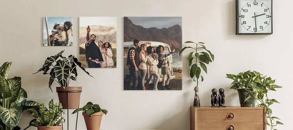
Quick break — here is the kind of mixed-format hallway display that does a lot with a little wall space. Worth a look before you dive into the rest of the ideas:
8. The stairway climb
If your front door opens onto a staircase — common in older two-story homes, narrow row houses, and split-level builds — the wall climbing up alongside the stairs is some of the most underused real estate in the house. A photo arrangement that follows the rise of the steps turns a passage into a feature.
The easiest version: a row of identically-framed prints, each one set slightly higher than the last, tracking the angle of the handrail. Keep the bottom of each frame about six inches above the handrail line. Three inches between frames so the row reads as one arrangement, not a stack of separate choices.
A more ambitious version: a full triangular cluster that fills the entire stairwell wall. This needs a high ceiling and a confident eye, but in a Colonial-style or Craftsman home with plenty of vertical space, it is one of the most striking displays you can build.
9. The travel-map centerpiece
A printed map of a city or country you love at the center of the wall, surrounded by photos from your time there. The map gives the display a focal point. The photos give it context. It is the layout that gets the most “oh, where was that?” questions from guests.
Try a 20x30 map at the middle and six 8x8 photos arranged around it. If you have visited several places that matter, this idea scales: one map for each city in a long horizontal row, with the trip photos directly underneath. Long hallway walls love this format — the horizontal repetition reads as a deliberate timeline.
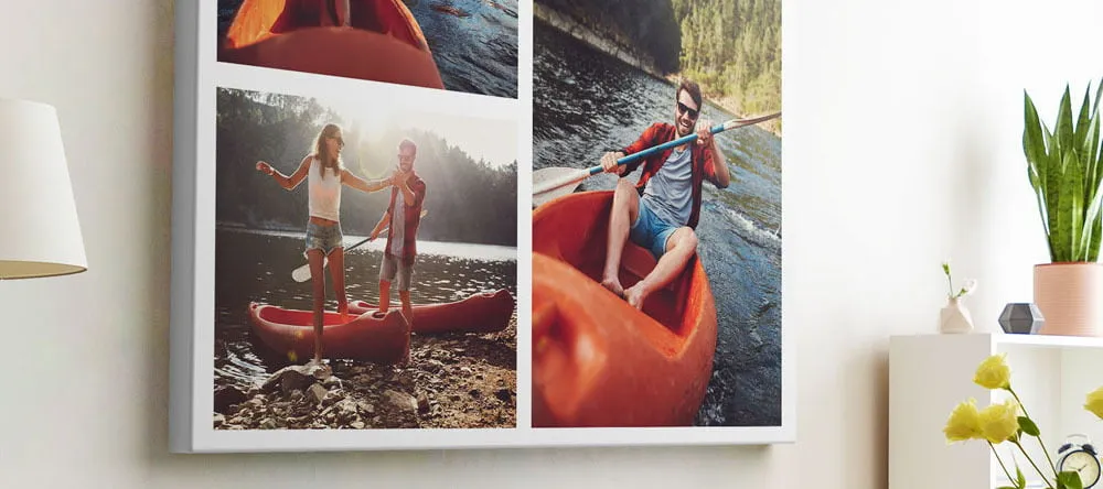
10. The mixed-format showpiece
The fastest way to make a hallway gallery look bought-from-a-decorator rather than thrown-together is to mix print formats. A wall of identical canvas prints — same size, same orientation — has a flat sameness to it. Mixing two or three formats adds depth the eye picks up before you can put it into words.
A combination that works almost every time:
- One large anchor piece in a bold, contemporary format
- Two or three softer canvas prints to add warmth and texture
- Three or four framed photos with white mats for the personal moments
For the anchor, a metal print on aluminum composite is hard to beat. The rich colors, sharp contrast, and slim modern profile pull the eye from across the room, and the slight metallic sheen at the edges keeps the rest of the gallery looking properly framed by comparison.
If you are torn between which format should be the anchor, our canvas vs metal print comparison walks through which one suits which kind of photo.
11. The renter-friendly tile grid
Drilling holes is not always an option. Apartment leases, plasterboard walls, the small but real possibility that you might move next year — all of these argue for something you can stick up and pull down without leaving a scar.
This is exactly what MIXPIX® photo tiles were built for. Square photo tiles printed on lightfoam, hung with a magnetic + adhesive system called Magnofix®. A small disc adheres to the wall, the tile snaps to the disc with a magnet. No nails, no screws, no patching at move-out. The magnet also means you can pull a tile off, rearrange it, swap it with another one — over and over — without ever touching the disc.
The most popular layout in American apartments right now is a 3-by-3 grid of nine tiles. The 8x8 tile size sits comfortably on its own as a complete display, or alongside larger pieces in a mixed gallery. For a rented entryway where you want photos without hassle, it is one of the cleanest solutions out there.
12. The asymmetrical pair around a doorway
If your hallway has a doorway, an arch, or a coat hook in the middle of the wall, you have a built-in frame for a smaller photo display. Hang one tall vertical print on one side and a smaller print or pair on the other side. Asymmetry feels purposeful in a way that perfect mirroring sometimes does not.
The detail that holds the asymmetry together: keep the tops of all the prints aligned at the same height. That single horizontal line — running across both sides of the doorway — is what reads as “designed” rather than “random.”
13. The big-art-small-budget approach
Large wall art does not have to mean a large invoice. Slim, lightweight panels printed with your photo can give you the impact of expensive gallery prints at a fraction of the cost — and they are dramatically easier to hang, because they barely weigh anything.
Two or three oversized Forex® photo board prints lined up horizontally along a long hallway wall make a strong, modern statement without the price tag of metal or acrylic. The quarter-inch hardfoam panels stay close to the wall, which matters in narrow corridors where you do not want prints sticking out into the walking path.
This is also the format to consider if you are decorating a rental and you want something larger than tile grids allow. Photo board is light enough to hang on Command Strips for prints up to about four pounds.
14. The premium acrylic showstopper
If you want one piece to do all the heavy lifting and you have the budget for something that feels properly luxurious, an acrylic photo print gives you more visual impact per square inch than almost any other format. The hand-polished acrylic glass produces a depth effect that makes the photo look nearly three-dimensional — colors are richer, contrast is sharper, and the surface picks up and reflects ambient light in a way that draws guests' eyes from across the room.
Acrylic works best with bold, high-contrast photos: dramatic landscapes, sharp architectural shots, vivid travel images, family portraits with strong color. A 20x30 acrylic centered above the entryway console can carry the whole entrance on its own — guests will notice it before they notice anything else in the room.
One thing to watch: acrylic is glossy, and gloss reflects. If your hallway sits directly opposite a bright window, position the print at a slight angle to the light, or choose a wall that gets indirect rather than direct sun.
15. The seasonal rotation wall
The best photo displays are not static. The wall you put up in January should not look identical in October. Your year has changed by then. Your photos have changed. Your wall can change too.
Set up a permanent skeleton of three or four anchor pieces — the family canvas, the wedding portrait, a print of a meaningful place — and surround them with rotating tiles that you swap with the seasons. Summer beach photos go up in June, fall foliage and family gatherings in October, holiday and travel shots in December, baby or birthday milestones whenever life produces them.
The anchor pieces give the wall continuity. The rotating tiles give it life. Once a season, swap two or three out. It takes ten minutes. It keeps the hallway feeling current for years.
Sizing cheat sheet for hallway photo displays
If you remember nothing else, remember the numbers in this table. They cover most American hallway situations and will keep you out of the most common sizing traps.
| Wall situation | Display width | Recommended layout |
|---|---|---|
| Above a 48" console table | About 32" wide | Anchor piece plus 4-6 supporting prints |
| Above a 36" console table | About 24" wide | Small grid or 3-print row |
| Narrow hallway, no furniture below | About 18" wide vertical | Vertical stack of 3-5 prints |
| Long hallway run (8 ft or longer) | 60-72" wide | Linear row or full salon cluster |
| Stairway wall | Follows the stair rise | Stepped row or triangular cluster |
| Above a 30" entryway bench | About 20" wide | Single anchor or tight cluster |
Print sizes by role
- Anchor piece (the focal point of the wall): 16x20, 20x24, or 24x36
- Secondary anchors: 11x14 or 12x16
- Supporting prints: 8x10 or 8x12
- Cluster fillers and rotating tiles: 8x8 MIXPIX® tiles or small framed prints
Hanging it without ending up on a stepladder twice
Different American wall types want different hardware. Tap your wall first. A solid sound means plaster on lath (common in homes built before the 1950s) or block. A hollow sound means drywall over studs, the standard since the 1960s.
Drywall over studs
Standard in most modern American homes. Studs sit 16 inches apart. Use a stud finder to locate them and aim heavier prints into a stud whenever possible. Between studs, use a proper drywall anchor — Toggler-style or self-drilling. Plain plastic plugs will pull out under any real weight.
Plaster on lath
Pre-drill the hole with a small masonry bit before you put anything in it. Plaster cracks easily if you hammer nails straight in. Use anchors rated for plaster, not standard drywall anchors.
Block or brick
Most often found in basements, garages converted into living space, and some Southwest construction. You need masonry anchors and a hammer drill, not a regular drill.
Weight rules of thumb
- Under 5 pounds: a standard picture hook or single drywall anchor is enough
- 5 to 10 pounds: toggle anchor or hang into a stud
- Anything wider than 20 inches: use two hanging points, not one — the print stays level even after a bump
Three options for renters
- Command Strips (3M) hold prints up to about 4 pounds. Clean the wall with rubbing alcohol first, press for 30 seconds, wait an hour before hanging.
- Magnofix® adhesive discs (the system behind MIXPIX®) are designed to peel off cleanly at move-out with no patching needed.
- Picture rails — if your older home has a horizontal molding strip about a foot below the ceiling, you have a built-in hanging rail. Use brass picture rail hooks with steel wire. Zero wall damage.
If you want a full walkthrough of planning a layout before you commit to drilling, the step-by-step guide to making a gallery wall covers the paper-template trick and the order of operations in more detail.
One last thing
The hallway is the part of the home people decorate last, if at all. Which is exactly what makes it such a quiet opportunity. A wall the rest of the world will see first, but that most of us have left blank for years.
Pick one of the 15 ideas above. Cut some paper templates. Tape them up. Live with it for a day. Then drill, hang, and step back. The transformation will feel out of proportion to the work involved — that is the small magic of decorating the spaces nobody else has thought about yet.
Frequently Asked Questions About Hallway Photo Displays
-
The center of your arrangement should sit between 57 and 60 inches from the floor. That is the standard gallery height and the natural eye level for most American adults. If your display hangs above a console or bench, leave 6 to 10 inches between the top of the furniture and the bottom of the lowest print.
-
Go vertical. A single column of three to five prints stacked at eye level adds height without crowding the walkway. Stick to photos with light or airy backgrounds — dark images visually shrink narrow spaces. Picture ledges also work well in tight corridors because they let you display multiple photos without protruding much from the wall.
-
Long corridors handle a horizontal linear row better than almost any other layout. Five to seven prints hung at the same center height, evenly spaced, running along one wall. The repetition pulls the eye down the corridor and makes the space feel deliberate. Mix orientations within the row but keep the vertical centerlines aligned.
-
For an anchor piece above a typical 48-inch console, use a 16x20 or 20x24. Secondary anchors work well at 11x14. Supporting prints sit comfortably at 8x10. The whole arrangement should span about two-thirds the width of any furniture below it.
-
Yes. Three good options. Command Strips (3M) work for prints up to about 4 pounds. MIXPIX® photo tiles use a Magnofix® adhesive disc designed to peel off cleanly when you move out. And if your building has picture rails — common in older apartments — brass picture rail hooks with steel wire give you full flexibility with no wall damage at all.
-
Yes. Modern smartphones (iPhone 11 and newer, Samsung Galaxy S20 and newer) have enough resolution for prints up to 20x24 in good light. The exception is heavily zoomed photos, which lose detail when enlarged. Use unzoomed wide shots and crop in software afterward.
-
Most people swap two or three pieces once a year. Keep the anchor pieces in place and rotate the supporting photos as the year goes. MIXPIX® tiles make this almost effortless — individual tiles can be swapped without disturbing the rest of the wall, so the refresh takes minutes rather than a Saturday afternoon.