How to Edit Your World Cup 2026 Photos Before You Print Them: A US Fan’s Field Guide
On July 19, 2026, the World Cup final kicks off at MetLife Stadium in East Rutherford, New Jersey. By that night, somewhere in the US, a fan is going to look at their camera roll — 6,000 photos heavier than it was a month ago — and decide which of them belong on a wall.
And then they’re going to send the best one straight to print. Probably without editing it. Probably without even checking if it’s the right size.
That’s the moment this guide is for.
A photo that looks crisp on your phone can come back from the printer looking soft, dull, or oddly tinted. The reds wash out. Faces go a bit waxy. The chain-link fence behind the goal post turns into the loudest thing in the frame. None of this is the printer’s fault. It’s the gap between how a screen shows a photo and how ink and canvas show a photo — and that gap is what editing closes.
What follows is everything an American soccer fan needs to know to get their World Cup 2026 photos ready for printing. No jargon, no Photoshop degree required, no $250 software subscription. Just the actual moves that take a phone shot and turn it into a print you’ll be proud to leave on the wall ten years from now.
Why a photo that looks great on screen can fall apart in print
Three things change when a photo leaves your phone and lands on a piece of canvas or framed paper.
First, size. A 12-megapixel iPhone photo is roughly 4,000 pixels wide. That looks pin-sharp on a 6-inch screen. Stretch it across 30 inches of wall and the same photo is suddenly only 130 pixels per inch — less than half the resolution that makes a print look crisp. Tiny imperfections you couldn’t see before — a touch of focus softness, motion blur on a player’s foot, JPEG compression artifacts from a screenshot — grow until they’re unmissable.
Second, light. A screen emits light. A print reflects it. That means a photo on your phone is lit from behind by a powerful LED, while a photo on your wall is lit only by whatever lamps happen to be in the room. Dark photos stay dark on the wall. Floodlit night games keep the warm yellow cast that your phone’s display was hiding.
Third, color. Phones and laptops can show a wider range of colors than printers can reproduce. The deep neon blue on the US away jersey may look fantastic in Instagram and disappointingly muted on a metal print, unless your edit accounts for it.
Every one of these problems has a fix. None of them takes more than a minute or two. The rest of this guide is those fixes, in the order you should do them in.

Start with the right photo (not the most exciting one)
Photo selection is where most prints are won or lost. Before you open any editor, do a hard cull of your World Cup camera roll. Ask three questions of every shot you’re considering:
- Is the subject in sharp focus? Pinch-zoom to 100%. If a face is soft on a phone screen, it will be soft on a 16x20 canvas — just bigger.
- Is the subject well-lit? Even at a dramatic night game, the person you actually want to see should not be a silhouette. Stadium lighting tends to blow out the field and underexpose the stands; pick photos that found a middle ground.
- Can you sum up what the photo is "of" in two words? "Goal celebration." "Kid in jersey." "Stadium sunset." If you can’t, the print will feel chaotic. The eye needs somewhere to land.
A useful trick: ask someone else to look at your shortlist. The shot you love because of the story behind it isn’t always the same as the shot a stranger would pick. A wall print needs to work for the stranger too.
Also keep in mind the practical wrinkle of a tournament that runs 38 days. The photo of the squad lifting the trophy doesn’t exist yet when the group stage starts. Smart fans plan their prints as something they’ll build over the tournament, not finalize on day one.
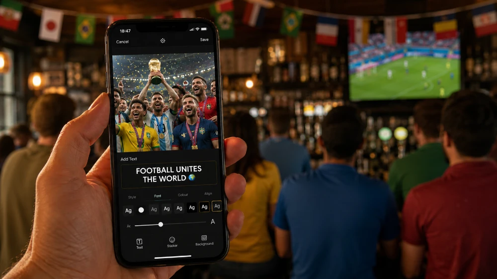
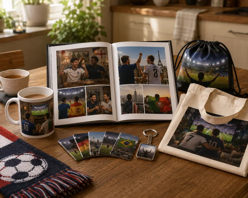
This is where MIXPIX® photo tiles earn their place in a soccer fan’s gear bag. They’re square 8x8-inch photo tiles that mount with a magnetic + adhesive Magnofix® system — no drilling, no permanent damage. A wall of nine tiles can update as the tournament unfolds: group-stage match days come down, knockout-round shots go up, and the final tile only gets added on July 20 once you actually have the trophy-lift photo. The flexibility matches the rhythm of how the tournament actually plays out.
The resolution check most fans skip
This is the technical step you really, really want to skip. Don’t. It’s the single biggest reason prints come back soft.
Resolution for print is measured in dots per inch, or DPI. The number to remember is 300. A sharp photo print needs 300 pixels of image data for every inch of printed area. That’s the standard every US print service is calibrated for.
The math is simple:
- A 10x10-inch canvas needs at least 3,000 x 3,000 pixels.
- A 16x20 canvas needs at least 4,800 x 6,000 pixels.
- A 30x40 canvas needs at least 9,000 x 12,000 pixels.
Most modern phones — iPhone 12 and newer, Samsung Galaxy S21 and newer, Pixel 5 and newer — capture roughly 4,000 by 3,000 pixels by default. That’s plenty for prints up to about 13x10 at full 300 DPI, and still very good up to 20x16 if the photo was sharply focused to begin with.
Here’s the quick reference:
| Print Size | Minimum Pixels (300 DPI) | Phone Camera Required |
|---|---|---|
| 8" x 10" | 2,400 x 3,000 | Any modern phone |
| 12" x 16" | 3,600 x 4,800 | iPhone 11+, most Androids 2019+ |
| 16" x 20" | 4,800 x 6,000 | iPhone 12+, recent Pixel/Galaxy |
| 20" x 30" | 6,000 x 9,000 | High-res mode, or DSLR/mirrorless |
| 24" x 36" | 7,200 x 10,800 | DSLR/mirrorless, or AI upscaling |
| 30" x 40" | 9,000 x 12,000 | DSLR/mirrorless preferred |
If your photo doesn’t hit the pixel count for the size you want, you’ve got two options. Order a smaller print, or use an AI upscaler to push the resolution up. Topaz Photo AI, Adobe’s Super Resolution (built into Lightroom), and free options like Upscayl can double or quadruple a photo’s pixel count with surprisingly clean results. They aren’t perfect — fine details like uniform stitching and hair sometimes look painted — but they’re miles ahead of uploading a small photo and hoping the printer figures it out.
For a wider primer on the canvas workflow from photo selection through ordering, our guide to how to make canvas prints walks the whole process in plain English.
Cropping with the print’s shape in mind
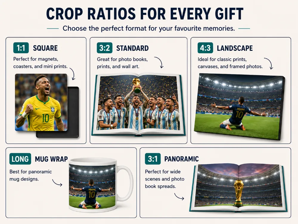
Phones shoot in a 4:3 aspect ratio by default. Most US print sizes don’t use 4:3. Which means: if you don’t crop your photo yourself before uploading, the print service will crop it for you, and you may not like the result.
Decide what print size you’re ordering first, then crop your photo to match. The most common aspect ratios you’ll run into:
- 1:1 (square) — for 8x8, 12x12, or 20x20 prints. Best for tight portraits and any composition that works dead center.
- 4:5 (portrait or landscape) — for 8x10, 16x20, 24x30. The traditional photo-print ratio and what most framed prints expect.
- 2:3 — for 8x12, 16x24, 20x30. Closer to what DSLRs and mirrorless cameras shoot natively. Good for wide-angle stadium views.
- Panoramic (1:3 or wider) — for 10x30, 12x36, 16x48. The format to use for sweeping stadium shots or fan-zone crowd panoramas.
Cropping isn’t just about hitting the right aspect ratio. It’s also where you fix the composition itself. Two basics:
Use the rule of thirds. Almost every photo editor shows a 3x3 grid overlay when you crop. Place the subject’s face, or the focal point of the action, on one of the four spots where those lines cross. The result almost always looks more deliberate than putting the subject dead center.
Cut distractions out of the edges. Strangers’ heads, blurry elbows, scoreboards halfway in the frame, water bottles on the ground — the eye is drawn to all of these. Crop them out aggressively. A tighter, cleaner photo almost always looks better than a wider, busier one.
One detail to know for canvas specifically: a gallery-wrapped canvas print wraps the image around the wooden stretcher bars at the edges. So the outer half-inch or so of your photo — on every side — ends up on the side of the frame, not the front. If your subject is too close to an edge, part of them will literally disappear around the corner. Most order screens show a "safe zone" preview that marks where the wrap will fall. Leave breathing room inside that zone, or choose a white-edge or mirrored-edge style that doesn’t wrap the image itself.
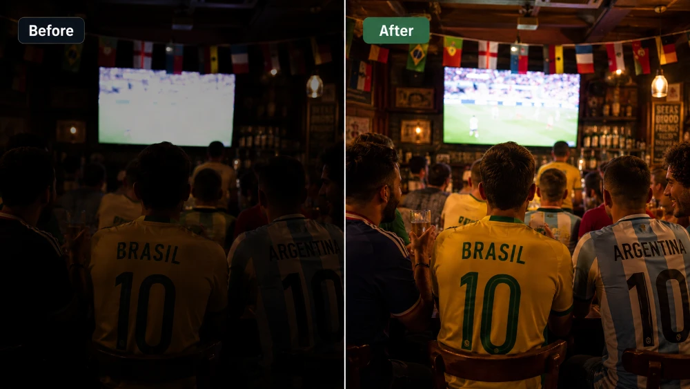
Fixing the stadium-light problem
Stadium photos almost never come out evenly lit. The pitch is bright. The stands are dark. Your phone’s camera averages everything and gets one part wrong. Daytime games are usually too bright on the field; night games are usually too warm on the field and too cool everywhere else.
Three sliders fix the vast majority of stadium-light problems, and they exist in every editor including the built-in Apple Photos and Google Photos apps:
Exposure (sometimes labeled Brightness) controls overall lightness. Lift it slightly if the photo looks dull. Drop it slightly if the field is washed out.
Shadows brightens only the dark areas without blowing out the highlights. This is the most under-used slider in all of photo editing. Push shadows up by 30 to 50 percent on most stadium photos and the faces in the crowd suddenly become visible — without the field turning into a glowing white mess.
Highlights does the opposite — pulls down only the bright areas. Useful when the floodlit field looks washed out and you can’t make out the players on it.
General rule: prints come back about 10 to 15 percent darker than they look on your phone screen. So push exposure and shadows a touch past what looks right on the phone. Your final print will land where you wanted it.
Worth noting that this rule changes depending on what you’re printing on. Acrylic prints have a glossy, glass-like surface with a slight 3D depth effect, and they actually love moody, lower-key photos — don’t lift the shadows too aggressively if acrylic is what you’re ordering. The format gives deep blacks an almost cinematic quality that flatter, brighter edits dilute. A photo of the trophy lift, a close-up of the goalkeeper’s gloves, or a stadium under floodlights at golden hour all sing on acrylic when the shadows are left dark.
The floodlight yellow problem: getting color right
Night-game photos have a problem nobody warns you about: stadium floodlights aren’t white. They’re slightly yellow-orange, and your phone’s camera tries to correct for it but rarely nails the job. The result is photos where the grass looks lime green, the white jerseys look beige, and everyone’s skin looks like they’ve been on vacation in Cancún.
This is a white balance problem, and every editor handles it slightly differently:
- Apple Photos: Edit, then the Cast slider — drag toward cooler.
- Google Photos: Edit, then Adjust, then Warmth — drag toward the left.
- Lightroom Mobile: Color panel, then the Temperature slider — drag toward blue.
- Snapseed: Tools, then White Balance, then Temperature.
Useful trick: pick something in the photo that you know is white — a jersey, a stadium sign, a corner flag, the white line on the field — and slide the temperature until that thing actually looks white on your screen. Everything else in the photo will fall into place.
Two more color sliders are worth a glance once white balance is right:
- Saturation boosts every color in the photo equally. Push it up 10 to 15 percent for prints. Watch skin tones — if your subject’s face starts looking orange, you’ve overdone it.
- Vibrance does the same thing but smarter. It boosts the dull colors more and leaves the already-bright ones alone, and it protects skin tones automatically. Use vibrance instead of saturation when both are available.
Color accuracy matters more for some print surfaces than for others. A framed photo print is the format most punished by a bad color cast: the bevel-cut white mat around the photo acts as a reference point, and the eye reads any color tint in the image against the pure white of the mat. A yellow cast that’s barely noticeable on a borderless canvas becomes obvious within a framed print. So if you’re editing for a framed photo — your kid at their first World Cup, a portrait of the family in matching jerseys at the watch party — take an extra minute on white balance.
Sharpening: a little goes a long way
Every photo can take a small sharpening pass before printing. The print process itself softens an image slightly, so a touch of sharpening compensates for that loss.
The catch is that over-sharpening is one of the most common mistakes fans make, and you can’t fix it after the print is on your wall.
A good rule of thumb: apply the smallest amount of sharpening that still makes the photo look snappier. If you can see bright halos or jagged outlines along the edge of a player’s jersey or hair, you’ve gone too far. Pull back until those artifacts disappear.
In each editor:
- Apple Photos: Edit → Sharpness. Use sparingly. Anything past 50% on the slider is usually too much.
- Google Photos: Edit → Adjust → Sharpen.
- Lightroom Mobile: Detail panel → Sharpening. Aim for somewhere between 25 and 40 for prints. The Masking slider underneath is worth learning — it limits sharpening to actual edges and leaves smooth areas alone, which prevents grain from being sharpened along with the subject.
- Snapseed: Tools → Details → Sharpening.
If your photo wasn’t in sharp focus when you took it, no amount of sharpening turns it into a sharp photo. Sharpening can rescue mildly soft images, but it cannot add detail that the lens never captured. If the focus is genuinely off, pick a different shot.
Cleaning up grainy night-game shots
Low-light photos — late-evening goals, fan-zone shots after dark, the tunnel walk-out, a watch party in a dim sports bar — almost always come back with noise. That’s the grainy speckle pattern that appears in dark areas when the camera sensor has to crank up its sensitivity to capture an image in low light.
Noise looks fine on Instagram. It looks terrible blown up to two and a half feet on a wall, especially anywhere the print surface is smooth and reflective enough to magnify it.
This is where surface choice becomes a real decision. A metal print — a borderless aluminum composite panel with the image printed directly onto its surface — has a clean, gallery-modern look that suits action photography and stadium architecture beautifully. But that same smooth aluminum finish reveals noise in dark areas more clearly than any other format. If you’re printing a low-light photo on metal, denoising is non-negotiable. If you’re printing the same photo on a textured canvas, you have a little more forgiveness.
Noise reduction tools that actually work in 2026:
- Apple Photos doesn’t have a manual denoise slider, but iOS’s Photographic Styles and Live Photos do quiet noise reduction automatically. The "Best Shot" picker also helps — iOS picks the cleanest frame from a Live Photo.
- Google Photos: Edit → Tools → Denoise. Free, fast, and good enough for moderately noisy photos.
- Lightroom Mobile: Detail → Noise Reduction → Color and Luminance. The paid Lightroom AI Denoise feature is the best in the consumer market right now — it cleans up shockingly grainy photos without making faces look waxy.
- Topaz Photo AI and DxO PureRAW — paid desktop apps, the gold standard for serious cleanup of very noisy images.
One critical detail: apply noise reduction before sharpening, never after. If you sharpen a noisy photo first, you sharpen the noise pattern itself, baking it in as fake detail that’s very hard to remove later.
And don’t go overboard. Aggressive denoising makes skin look smooth and plastic, almost cartoonish. A photo with a small amount of natural grain looks more like a real photograph than one that’s been scrubbed completely clean.
Getting rid of distractions
Most "great" World Cup photos have at least one element you wish wasn’t there. A stranger’s blurry head in the foreground. A garbage can next to a stadium gate. A bright EXIT sign over a goal celebration. The guy on his phone behind your kid in the watch-party photo.
A decade ago, this was a Photoshop job and a half-hour of careful clone-stamping. Today, your phone does it in three taps.
- iPhone (iOS 18.1 or newer): Edit → Clean Up. Circle the object you want gone, tap, and it’s gone. Apple’s on-device AI handles the fill-in.
- Google Photos Magic Eraser: Edit → Tools → Magic Eraser. Same idea, also excellent. Available on most Android phones and now Pixel-free iPhones.
- Snapseed: Tools → Healing. The classic. A bit fiddlier than the newer AI tools but very precise.
- Adobe Photoshop Express: Spot Heal. Works on phones, tablets, and the desktop.
The trick is to be subtle. If you’re having to erase half the background, the photo’s composition is the problem, not the background — a tighter crop will fix more than the eraser will. But for the small annoying detail in an otherwise perfect shot, these tools are quick and effective.
One caveat: AI erasers sometimes leave the patched area looking soft or smudgy. Zoom in to 100% after using one and check the patched area. If it looks off, undo and try a tighter crop instead.
Saving and exporting the file
You’ve done the work. Now save the file properly so all of that work actually reaches the printer.
Three settings matter and the rest you can ignore:
File format: JPEG (highest quality) or TIFF.
JPEG at maximum quality is the safest default — every print service accepts it, file sizes are manageable, and the quality is excellent. TIFF is uncompressed and slightly higher quality, but creates very large files and isn’t always supported by consumer print sites. PNG creates needlessly large files for photographs. HEIC is the iPhone default and not universally supported by print services — convert to JPEG before uploading, or change your iPhone’s camera setting to JPEG by default (Settings → Camera → Formats → Most Compatible).
Color space: sRGB.
Almost every consumer print service in the US, including canvasdiscount.com, calibrates to sRGB. If you edited on a desktop with Adobe RGB or ProPhoto RGB selected, convert to sRGB before exporting. Skipping this step is the single most common cause of colors looking muted or off in the final print. In Lightroom or Photoshop, the Export dialog has a Color Space dropdown — set it to sRGB.
Quality slider: maximum.
When exporting JPEG, drag the quality slider all the way to 100 (or "Max"). A 5MB file is fine for a 24x36 print. Don’t shrink your file to save bandwidth — you’ll save 30 seconds of upload time and lose half the detail you just edited in.
One more practical note. If your phone offers a "Photo Quality" toggle when sharing or sending (in Messages, Mail, or AirDrop), always choose Actual Size or Large. Never "Small" or "Medium." Same when downloading from cloud storage — pick "Original," not the "Optimized for this device" version. A surprising number of soft prints come from photos that were silently compressed in transit between your phone and your laptop.
A note on the bigger picture: not every World Cup memory belongs on a wall. The full story of a tournament — the build-up, the lead-up to the final, the watch parties, the rare in-stadium moments — sometimes works better as a photo book. Photos sit smaller on each page so the resolution requirements relax, and the layflat binding means double-page spreads can take a panoramic stadium shot without the spine cutting through the action. For fans who took 800 photos over the month and want to remember all of them — not just the headline shots — a photo book is the right format to think about alongside the wall prints. And if you’re going to display the wall prints together, our 100+ gallery wall ideas guide is worth a read for layout inspiration.
What apps real fans actually use
You don’t need to spend a dime on software. The free options today are better than what professional photographers paid hundreds for fifteen years ago. The short list, organized by use case:
For most fans, on a phone, for free:
- Apple Photos (iPhone) and Google Photos (everywhere) — built in, covers cropping, exposure, color, sharpening, basic noise reduction, and now AI cleanup. For 90% of fans, this is all the editor you’ll ever need.
- Snapseed (free, Android and iOS) — Google’s older photo editor. Still excellent, especially the Healing tool, which is best-in-class among free apps.
- Adobe Photoshop Express (free tier) — surprisingly capable, with good cleanup tools.
For power users who want more control:
- Adobe Lightroom Mobile — the gold standard for serious mobile photo editing. The free tier covers a lot; the paid version unlocks AI Denoise, presets, and cloud sync. About $10/month as part of Adobe’s photography plan.
- VSCO — stronger on look and mood presets than on technical fixes. Beloved by anyone who wants a consistent stylistic feel across a set of photos.
On a desktop:
- Adobe Lightroom + Photoshop — the industry standard. ~$12/month with the photography plan.
- Affinity Photo — one-time purchase (around $70), no subscription, comparable to Photoshop for most uses.
- GIMP — free, open-source, fully featured. Steeper learning curve.
- Photopea — runs in your browser, mimics Photoshop closely. Free.
For AI cleanup and upscaling specifically:
- Topaz Photo AI — paid, the best dedicated AI noise reduction and upscaling on the market.
- Upscayl — free, open-source, runs locally on your computer. Surprisingly good at enlarging older photos.
- Adobe Super Resolution (inside Lightroom) — doubles your pixel count cleanly and quickly.
The honest answer for most fans planning one or two prints from the tournament: Snapseed or the free tier of Lightroom Mobile is the sweet spot. Powerful enough for everything in this guide, free, with a learning curve measured in minutes not weeks.
How your edits read on different print surfaces
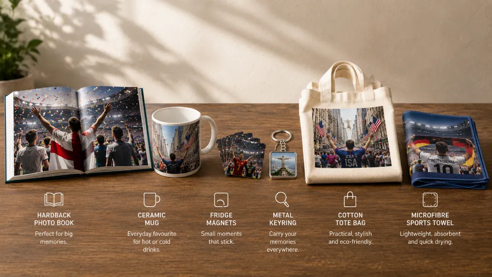
Different print surfaces interact with light differently, and the edit that flatters one format can hurt another. Here’s the cheat sheet for matching your edit to your chosen surface.
Canvas has a subtle woven texture that absorbs about 5 to 10 percent of the light a flat photo paper would reflect. That means dark photos look slightly darker on canvas than they did on your screen — so push exposure or shadows a touch higher than you would for another surface. The same texture is forgiving on sharpness, so a small amount of softness in the original photo is less visible. Canvas is the all-rounder for atmospheric stadium and crowd shots. (If you’re new to the format and want a deeper primer, our explainer on what is a canvas print walks through how it’s made and what makes it different from a poster.)
Metal is the opposite. The aluminum composite surface is smooth and glossy, and it reveals every pixel of detail — good and bad. Don’t over-sharpen for metal; the surface does the sharpening for you. Saturation also intensifies on metal, so pull saturation back 5 to 10 percent rather than pushing it forward. Metal is the right pick for action shots, kit close-ups, and any photo where color richness is doing the heavy lifting.
Acrylic combines a glossy front-facing acrylic glass panel with rich color reproduction underneath. The slight depth effect of the acrylic gives photos a near-3D quality, and the format loves deep blacks. Don’t lift shadows aggressively for an acrylic print — the moody, dramatic photos with rich dark areas are the ones that look most cinematic. Best for the trophy lift, the goalkeeper close-up, a stadium under floodlights at dusk.
Framed photo prints with a white mat read as the most editorial, magazine-quality format. The white mat acts as a reference point that exposes any color cast in the photo, so white balance accuracy matters more here than for any other surface. Punch contrast slightly more than you would for canvas. Best for intimate, personal shots — portraits, family in jerseys, the kid at their first World Cup.
MIXPIX® photo tiles are square 8x8-inch lightfoam panels with a glossy front and a magnetic-adhesive hanging system that comes off cleanly. They’re forgiving on resolution and tolerant of simple, punchy edits. Think in groups: a wall of nine tiles tells a story that no single tile can. The square format means cropping to a 1:1 ratio and keeping your subject central or on the rule-of-thirds intersection.
Photo books show photos at smaller sizes per page, so resolution requirements relax. Mix wide shots and detail shots for visual rhythm. Don’t use only the action moments — the human-side photos (family, friends, food, travel) are what carry a book across 30 pages.
Five mistakes that ruin a World Cup print
After looking at thousands of customer prints that came back disappointing, the same five mistakes show up over and over. Avoid them and your odds of a great print go way up.
Editing on a phone screen at full brightness.
Your phone screen is far brighter than any printed photo will ever be. Drop your screen brightness to about 50 percent before editing. The photo will look much closer to how it’ll actually print.
Cropping too tight.
Canvas prints wrap around the frame. Framed prints get covered by a mat. Both eat into the visible image. Leave at least 5 percent breathing room on each side of your subject, and trust the safe-zone preview the order screen shows you.
Trusting auto-edit blindly.
The auto-edit features in Apple Photos and Google Photos are good — but calibrated for screens, not prints. They tend to over-saturate and over-sharpen for the screen environment. Use auto-edit as a starting point and then dial it back about 30 percent.
Saving in the wrong file format.
HEIC is the iPhone default and many print services either don’t accept it or quietly convert it in ways you didn’t expect. Convert to JPEG before uploading, or change your iPhone camera setting to "Most Compatible." Same for color space — if you edited in Adobe RGB on a desktop, convert to sRGB before exporting.
Skipping the print preview.
Almost every print site lets you preview the final crop and composition before checkout. Use it. A fingertip at the edge of the frame, an awkward crop on a face, a tilted horizon — you have one chance to fix these. After printing, you don’t.
The 10-minute print-day checklist
| # | What to do | Why it matters |
|---|---|---|
| 1 | Drop your phone screen brightness to about 50% | Your edits will match how the print actually looks on a wall. |
| 2 | Find the original file in your camera roll (not the chat-app copy) | Messages, Mail, and AirDrop can secretly compress photos. |
| 3 | Pinch-zoom to 100% to check focus | Soft on a phone = blurry on a 16x20 canvas. |
| 4 | Crop to the aspect ratio of the print you’re ordering | Stops the print service from cropping your subject for you. |
| 5 | Lift Shadows by 30–50% if the photo is dark | Prints come back about 10–15% darker than your screen. |
| 6 | Cool the Temperature slider until whites look white | Fixes the floodlight yellow cast that ruins night-game photos. |
| 7 | Add a small amount of sharpening (25–40 in Lightroom Mobile) | Compensates for the slight softening the print process adds. |
| 8 | Run noise reduction before sharpening, not after | Sharpening locks in grain if you do it first. |
| 9 | Export as JPEG, sRGB color space, quality 100 | Standard for every consumer print service in the US. |
| 10 | Use the print preview to check the crop one last time | Last chance to catch a fingertip at the edge of the frame. |
That’s it. Ten steps, ten minutes, and the photo on your wall will hold up for a decade.
Final word
The 2026 World Cup is a one-time event for American soccer fans. The US hasn’t hosted since 1994, and it won’t host again for decades. The 11 American host cities, the 80 matches across the three countries, the final at MetLife on July 19 — these are the photos you’ll come back to for the rest of your life.
Ten minutes of editing turns a phone snapshot into a print that does justice to all that. Crop with intention. Lift the shadows. Cool the floodlight yellow. Sharpen gently. Reduce the noise. Save as a max-quality JPEG in sRGB. Upload.
You’ll look at the result every day. Make it worth looking at.
Frequently Asked Questions About Editing World Cup Photos
-
At the 300 DPI standard, a 16x20 print needs at least 4,800 x 6,000 pixels. Most modern phones (iPhone 12 and newer, Samsung Galaxy S21 and newer, Pixel 5 and newer) shoot at 12 megapixels or higher, which is enough for sharp 16x20 prints when the photo was sharply focused to start with.
-
For most fans, a phone is enough. Editors like Snapseed, Lightroom Mobile (free tier), Apple Photos, and Google Photos cover every fix in this guide. A computer helps if you’re editing dozens of photos at once, want larger sliders for fine control, or plan to use AI tools like Topaz Photo AI. But for one or two prints from a tournament, a phone is fine.
-
Snapseed, made by Google, free on iPhone and Android. Covers cropping, exposure, color, sharpening, healing, and basic noise reduction. Lightroom Mobile’s free tier is a close second and adds slightly better noise tools.
-
Mildly soft photos can be improved with sharpening (in any editor) and AI upscaling (Topaz Photo AI, Upscayl, or Lightroom’s Enhance). Genuinely blurry photos — the kind where you can’t identify the player — can’t be rescued. Sharpening adds edge contrast, but it can’t create detail the lens never captured. Pick a different photo.
-
JPEG at maximum quality. PNG creates unnecessarily large files for photographs and isn’t universally supported by consumer print services. TIFF is also fine but bulky. Avoid HEIC — convert iPhone HEIC files to JPEG before uploading.
-
sRGB. Every consumer print service in the US calibrates to sRGB. If you edited in Adobe RGB or ProPhoto RGB on a desktop, convert to sRGB before exporting or the colors will print muted and off-tone.
-
Technically yes, but those platforms compress photos heavily. Always start from the original file in your phone’s camera roll, not the version that’s been through social media. A photo that looks fine on Instagram can come back grainy and soft when blown up to 16x20 or larger.
-
Lift the Shadows slider first, then add a small bump to overall Exposure, then a touch of Contrast if the photo looks flat. AI denoise tools (Lightroom AI Denoise, Topaz Photo AI) rescue significantly more detail from dark photos than the basic shadow slider alone. And remember: prints come back about 10 to 15 percent darker than the phone screen, so push brightness a touch beyond what looks right on screen.
-
In most editors, very little. "Exposure" is the more accurate name — it shifts the whole tonal range of the photo. "Brightness" (where it exists as a separate slider) lifts midtones without changing the brightest highlights or the deepest shadows. Use exposure when you have the choice.
-
It depends on the print site. canvasdiscount.com accepts JPEG, PNG, GIF, and WEBP up to 60MB; HEIC support varies more across providers. Converting to JPEG before uploading sidesteps any compatibility headaches. On iPhone: Settings → Camera → Formats → Most Compatible switches new photos to JPEG going forward. For existing photos, any free converter app works.
-
Used gently, no — AI tools can dramatically improve a difficult photo. Used too heavily, yes. AI denoise can make faces look waxy. AI sky replacement looks fake when the lighting on the subject doesn’t match the new sky. AI upscaling can invent details that weren’t there. Apply AI features lightly, zoom in to 100% to check the results, and back off if anything looks artificial.
-
Three to five minutes for most photos. Crop, exposure, white balance, light sharpening, light noise reduction, export. If a photo is taking 20 minutes, it’s probably the wrong photo to print. Pick a different one.
-
The technical fixes (resolution, color, sharpening) are the same. The only thing worth thinking about is lighting context — the 2026 men’s World Cup runs June and July in the Northern Hemisphere summer, so plenty of games will be in daylight or at golden hour. White balance will be easier for daytime matches than for the floodlit night games. Apply the same workflow regardless.