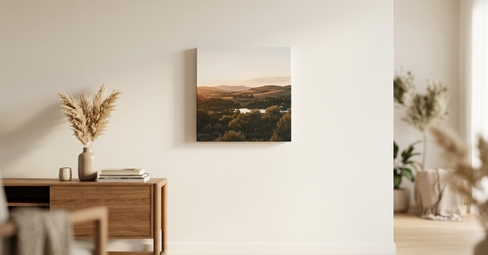
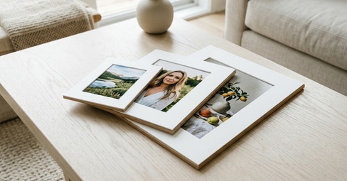
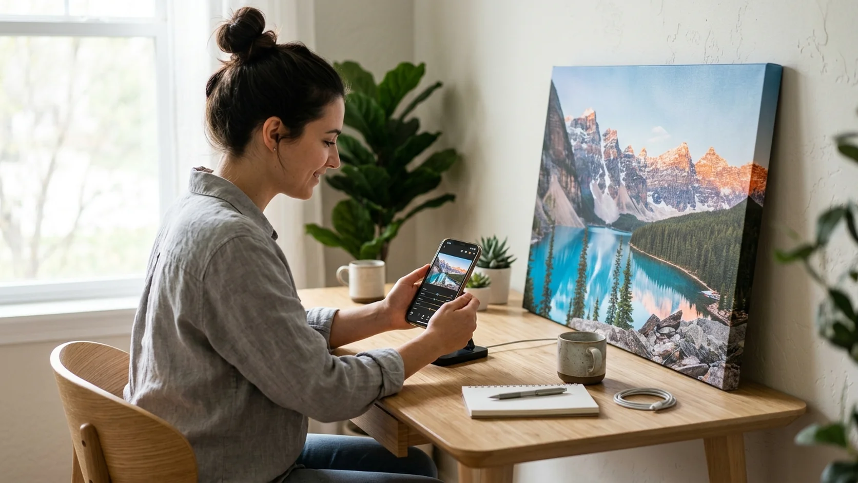
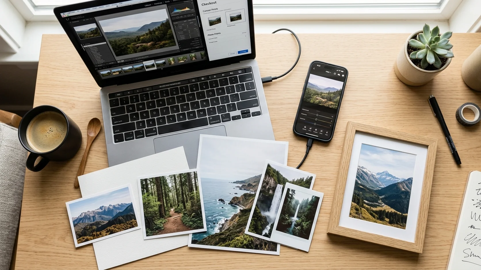
Your phone took a great photo. You ordered a canvas print. It arrived and something was off. The colors looked different. The shadows were too dark. The whole image had a yellowish tint that was not there on your screen. This is the most common disappointment in photo printing, and it is almost never the printer's fault. The gap between how a photo looks on a screen and how it looks on canvas, paper, or acrylic comes down to photo editing for better prints. A few simple adjustments, most of them taking less than thirty seconds on your phone, close that gap entirely. These 12 photo editing tips are specifically for people who want to print their photos, not post them online. The rules are different, and knowing them is the difference between a print that looks professional and one that looks like a faded photocopy.
In a nutshell: Editing photos for printing requires different adjustments than editing for social media. Prints need slightly higher brightness and saturation than what looks good on screen because physical surfaces absorb light rather than emitting it. The 12 rules cover resolution, brightness, saturation, white balance, cropping for the wrap edge, straightening, sharpening, color space, file format, and test printing. All adjustments can be done on a free phone app in under two minutes.
Key Takeaways
- Screen and print look different by design. Screens emit light; prints absorb it. A photo that looks perfect on screen will always look slightly darker and less saturated on a physical surface unless you compensate.
- Brightness up, saturation up. Increase brightness by 10 to 15 percent and saturation by 10 to 15 percent before printing. This is the single most impactful adjustment for print quality.
- Resolution is non-negotiable. Always use the original file from your camera roll. Screenshots, texted photos, and social media downloads are compressed and will print blurry at large sizes.
- White balance fixes color casts. Indoor photos often have a yellow or blue color cast from artificial lighting. Correcting white balance takes two seconds and eliminates the most common "the colors look wrong" complaint.
- Leave room for the wrap. Canvas prints fold the image around the frame edges. Keep faces and important details away from the outer half-inch.
- You do not need Photoshop. Every adjustment in this guide can be done with the free built-in photo editor on your iPhone or Android, or with free apps like Snapseed and Google Photos.
The Best Products for Your Edited Photos
Once your photo is edited for printing, these are the products that showcase it best.
Rules 1 to 4: The Foundation
Rule 1: Always Use the Original File
This is the single most important rule and the one most people break without realizing it. The original photo in your camera roll is a large, high-resolution file. The version someone texted you, the one you downloaded from Instagram, or the screenshot you took of a photo someone posted: those are compressed copies that have lost the detail needed for printing. A 12-megapixel original can print beautifully at 24x36 inches. A screenshot of the same photo might struggle at 8x10. Always go back to the original file. If the photo is on someone else's phone, ask them to AirDrop it or share it through a cloud service that preserves the original quality.
Rule 2: Increase Brightness by 10 to 15 Percent
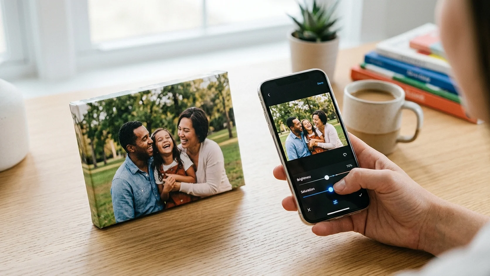
This is the adjustment that makes the biggest visual difference between a good print and a great one. Your phone screen is a backlit display that emits light directly into your eyes. A canvas print is a physical surface that absorbs light and reflects it back. This fundamental difference means that every photo will look slightly darker on canvas than it does on screen. Increasing brightness by 10 to 15 percent before uploading compensates for this. The photo will look slightly overexposed on your phone, and it will look perfect on the canvas. This applies to all print surfaces: canvas, acrylic, metal, paper, and poster.
Rule 3: Boost Saturation by 10 to 15 Percent
For the same reason prints look darker, they also look less saturated. The colors are slightly muted compared to the glowing screen version. Boosting saturation by 10 to 15 percent before printing restores the vibrancy. Be careful not to overdo it: over-saturated photos look unnatural, with skin tones turning orange and greens becoming neon. A subtle boost is all you need. On iPhone, this is the Saturation slider in the Edit menu. On Android, it is in the Adjust section of Google Photos.
Rule 4: Fix White Balance
White balance corrects color casts caused by artificial lighting. Photos taken under incandescent bulbs have a warm yellow-orange cast. Photos under fluorescent lights have a cool blue-green cast. On screen these casts are often subtle enough to ignore, but when printed at a larger size they become obvious and distracting. Adjusting white balance (sometimes labeled Warmth or Temperature in photo editors) removes the cast and makes the colors look natural. Slide toward blue to fix yellow casts, and toward yellow to fix blue casts. Stop when white objects in the photo look genuinely white.
Rules 5 to 8: Composition and Framing
Rule 5: Crop With the Print Size in Mind
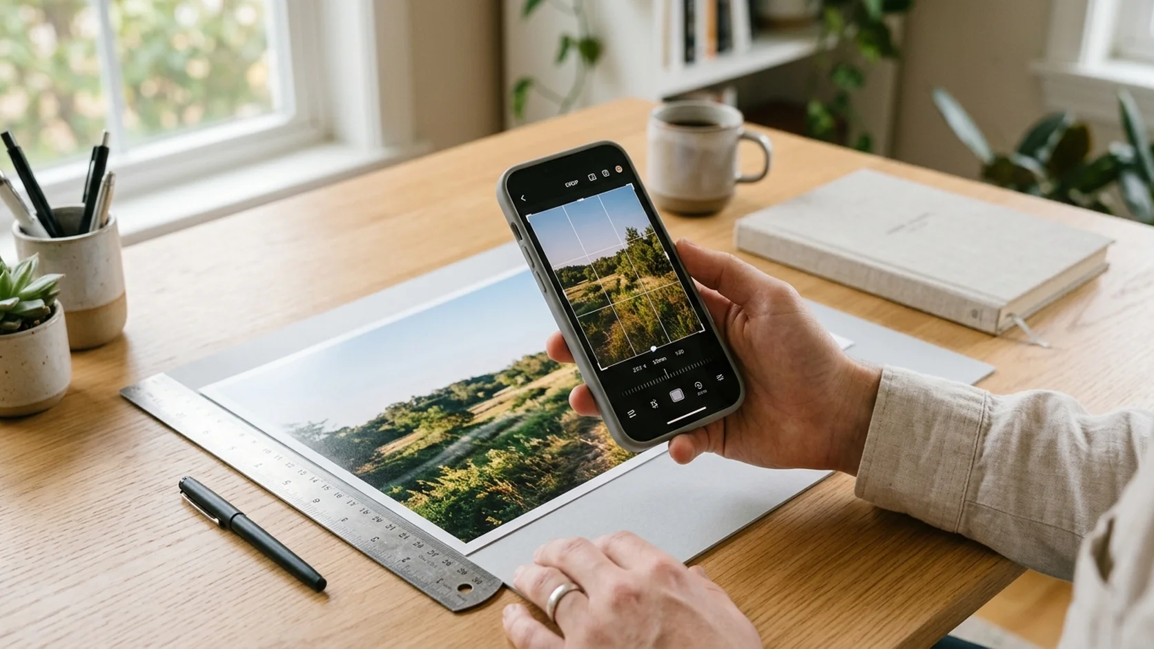
Different print sizes have different aspect ratios. A 4x6 is 2:3. An 8x10 is 4:5. A 16x20 is also 4:5. If your photo's aspect ratio does not match the print size, the system will crop the excess automatically, and it might crop exactly the part you wanted to keep. Before uploading, crop your photo to match the intended print ratio. Most phone editors have preset crop ratios (4:5, 2:3, 16:9, square) that make this simple. For a full breakdown of which sizes match which ratios, see our photo print sizes guide.
Rule 6: Straighten the Horizon
A tilted horizon is invisible on a phone screen and painfully obvious on a wall. When a canvas print hangs straight and the horizon inside is tilted two degrees, the image looks wrong even if the viewer cannot articulate why. Every phone photo editor has a straighten or rotate tool. Use it. This takes three seconds and prevents a problem that no amount of other editing can fix after printing.
Rule 7: Leave Room for the Canvas Wrap
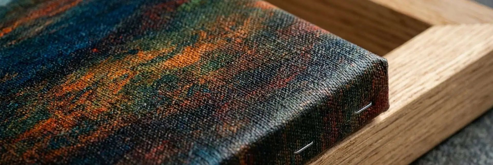
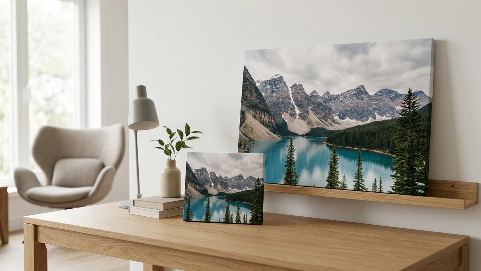
Gallery-wrapped canvas prints fold approximately half an inch of the image around each side of the stretcher frame. This means the outer edges of your photo are not visible from the front. If a person's face, a line of text, or any important detail sits right at the edge of the photo, it will wrap around the side and be hidden. The fix: either crop slightly to move important content inward, or switch to a mirror wrap or solid color edge option when ordering. Most canvas print ordering tools show a preview with the wrap area indicated.
Rule 8: Apply Subtle Sharpening
Sharpening enhances edge contrast and makes details look crisper. Most phone cameras apply some sharpening automatically, but a small additional boost (10 to 20 percent in the Sharpen or Structure slider) can make a noticeable difference on large prints where fine details are more visible. Do not over-sharpen: excessive sharpening creates an unnatural halo effect around edges that looks digital and harsh. If in doubt, apply less than you think you need.
Rules 9 to 12: Advanced Preparation
Rule 9: Reduce Noise on Low-Light Photos
Photos taken in low light (indoor events, evening shots, dimly lit restaurants) often contain visible noise: a grainy, speckled texture that becomes more obvious at larger print sizes. Many phone editors include a Noise Reduction or Denoise tool. Apply it gently to smooth out the grain without losing too much detail. If the photo is extremely noisy, consider printing it at a smaller size where the grain is less visible, or converting it to black and white where grain can look intentionally artistic.
Rule 10: Export at Full Quality
When you save or export your edited photo, choose the highest quality setting available. On iPhone, saving from the built-in editor preserves the original quality automatically. On Android or in third-party apps, look for export settings: choose JPEG at 100 percent quality or save as PNG (lossless). Avoid any option that says "optimized for sharing" or "reduced file size," as these compress the image and lose detail that matters at print scale.
Rule 11: Edit on a Properly Lit Screen
The screen you edit on affects every decision you make. A phone screen at full brightness in a dark room makes photos look brighter and more saturated than they really are, which means you will under-compensate when boosting for print. Edit in a well-lit room with your screen at about 70 to 80 percent brightness. This gives you a more accurate baseline, and the adjustments you make will translate more reliably to the printed result.
Rule 12: Order a Small Test Print First
If you are ordering a large, expensive canvas print and you are not sure your edits are dialed in, order a small, inexpensive test first. An 8x10 canvas print or a custom poster print costs very little and shows you exactly how your edits translate to the physical surface. Compare the test print to your screen. If the colors match and the brightness feels right, order the large version with confidence. Five dollars on a test print can save fifty on a reorder.
The Complete 12-Rule Quick Reference
| # | Rule | What to Do | Tool |
|---|
| 1 | Use the original file | Upload from camera roll, never screenshots or social downloads | Camera roll / Files app |
| 2 | Increase brightness | Boost +10 to 15% | Brightness slider |
| 3 | Boost saturation | Boost +10 to 15% | Saturation slider |
| 4 | Fix white balance | Remove yellow/blue color casts | Warmth / Temperature slider |
| 5 | Crop to print ratio | Match 4:5 for 8x10/16x20, 2:3 for 4x6/24x36 | Crop tool with ratio presets |
| 6 | Straighten horizon | Level any tilted horizons | Rotate / Straighten tool |
| 7 | Leave wrap room | Keep faces and text away from outer 0.5 inch | Crop tool |
| 8 | Sharpen subtly | Boost +10 to 20% | Sharpen / Structure slider |
| 9 | Reduce noise | Smooth grain on low-light photos gently | Noise Reduction / Denoise |
| 10 | Export full quality | Save as JPEG 100% or PNG | Export / Save settings |
| 11 | Edit on a lit screen | 70 to 80% brightness, well-lit room | Screen brightness setting |
| 12 | Test print first | Order a small test before committing to large sizes | Any small print product |
Which Print Surface Responds Best to Editing?
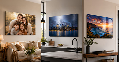
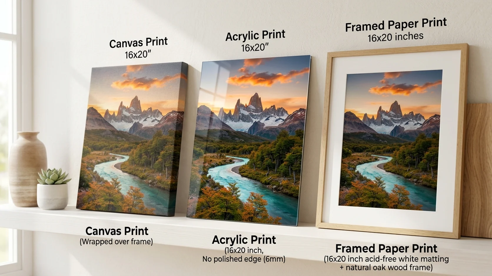
Different surfaces respond differently to the same edits. Canvas prints absorb the most light, so the brightness and saturation boost matters most here. Acrylic prints amplify colors and contrast, so you may need less saturation boost (5 to 10 percent rather than 15). Metal prints add a cool metallic undertone, so warming the white balance slightly before printing compensates. Framed photo prints on standard paper behave most like what you see on screen, requiring the least adjustment.
For a detailed comparison of how each material handles color and light, see our canvas vs metal vs acrylic comparison guide. For canvas sizing after editing, check our canvas print size guide.

Frequently Asked Questions
Do I need to edit photos before printing on canvas?
You do not need to, but a few quick adjustments make a significant difference. At minimum, boost brightness and saturation by 10 to 15 percent each. Canvas absorbs light, so photos that look slightly bright on screen look perfect on canvas.
What is the best free app for editing photos for printing?
The built-in photo editor on your iPhone or Android handles all essential adjustments: brightness, saturation, white balance, crop, straighten, and sharpen. For more control, Snapseed (free, by Google) offers professional-level tools with a simple interface.
Why do my prints look darker than on screen?
Screens emit light; prints absorb and reflect it. This physical difference means prints always appear slightly darker than the screen version. Increasing brightness by 10 to 15 percent before printing compensates for this.
Should I edit differently for canvas versus acrylic?
Yes. Canvas absorbs more light and needs a larger brightness and saturation boost (10 to 15 percent). Acrylic amplifies colors, so a smaller boost (5 to 10 percent) is usually enough. Metal prints add a cool tone, so warm the white balance slightly.
What file format is best for printing?
JPEG at 100 percent quality is the standard for photo printing. PNG (lossless) also works well. Avoid any compressed or optimized-for-web format. Always save at the highest quality your editor offers.
How do I know if my photo has enough resolution for a large print?
Zoom into the photo on your phone at full magnification. If faces and details still look sharp, the resolution is sufficient for canvas prints up to 24x36 inches. Most smartphones from the last 3 to 4 years capture more than enough resolution.